1.Name of photographer – Justin Motts
-stories
– the focus (selective focus), the idea of some photos (what he shot), trying to get the story out of the photo
- Tells a story and shows concern, likes the face in the floor ground, good composition
- It was really acward and strange. Had a lot of space and weird shots. Very unexplainable. There were a few strong shots but over all it was an unusual portfolio.
2.The competition of each photo is different
In every photo someone is doing something different
They liked every photo
They liked how he got out there and in everything
Nice sport shots
Everything is different
Different emotions every time
Nice Photoshop
Great facial expression
I really didn’t see any weaknesses
3.How many strong photos are in there
The stories they show
The emotion the photo in the portfolio gives
How the portfolio is done
Good editor of the portfolio
1.In the Cross Country photo i agree with the amazing shot and how it her body language shows her trying to get the goose away from her.
2.For starters they dnot like the view of the first picture. I honestly do like the view showing his speed down the track
Monday, March 17, 2008

Wednesday, February 6, 2008
Langston Poem
Read: 15 min.
April Rain Song
By: Langston Hughes
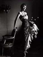
This photo is sertainly a Formal
Photo. It makes it more formal with
the black and white affect.
She is Dressed Formal dosnt have
and exspression on her face and
is looking directly at the camra.
Her pose is kinda akward but looks
very formal leacing back on the chair.
The Lighting is dark yet has a strange
light that brings out important elements
in the photo that are important to see
and really focus on the details like her face and dress texture.
It seems as if there is a window open bring the light in ot the light
sorce is coming in from the right to reflect on to the lady.
April Rain Song
By: Langston Hughes

This photo is sertainly a Formal
Photo. It makes it more formal with
the black and white affect.
She is Dressed Formal dosnt have
and exspression on her face and
is looking directly at the camra.
Her pose is kinda akward but looks
very formal leacing back on the chair.
The Lighting is dark yet has a strange
light that brings out important elements
in the photo that are important to see
and really focus on the details like her face and dress texture.
It seems as if there is a window open bring the light in ot the light
sorce is coming in from the right to reflect on to the lady.
Wednesday, January 30, 2008
Best Covers
#1 informal
#2 formal
#3 informal
#5 informal
#9 formal
#10 formal
#13 envormental
#15 formal
#18 enviormental
#19 formal
#21 enviromental
#22 informal
#24 informal
#26formal
#27 informal
#28 enviromental
#29 informal
#30 enviromental
#32 formal
#35 informal
#36 formal
#37 formal
#37 formal
#37 informal
#2 formal
#3 informal
#5 informal
#9 formal
#10 formal
#13 envormental
#15 formal
#18 enviormental
#19 formal
#21 enviromental
#22 informal
#24 informal
#26formal
#27 informal
#28 enviromental
#29 informal
#30 enviromental
#32 formal
#35 informal
#36 formal
#37 formal
#37 formal
#37 informal
Cover History
Early Magazine Covers started out with no picture really and had a title and a table of contens on the front. Soon to come is when simple pictures came along, and they made a book-like cover which came out in the 1700s and 1800s and was soon everywhere. The coveres seemd to get more detailed photos.
The Poster Cover was a Cover where there was a large dominate photo. It was poster like and had minimum words on the cover. The covers of many of these oversized magazines looked like they were printed to be hung up on a wall.
Pictures Married to Type focused on using lines in the cover. The placement of the photo determins the depth of layering planes. The bottom crosses two or more planes as it comes forward to the right of the picture pushing the lines forwards with it.
In the Forest of Words is the more modernt look we have today. The photo has diffrent subtitles surouding the photo. The covers photo is just as important and has nomber of vivid color lines. The image and the color lines over lap, and the modles pose leaves room around to place the color lines.
The Poster Cover was a Cover where there was a large dominate photo. It was poster like and had minimum words on the cover. The covers of many of these oversized magazines looked like they were printed to be hung up on a wall.
Pictures Married to Type focused on using lines in the cover. The placement of the photo determins the depth of layering planes. The bottom crosses two or more planes as it comes forward to the right of the picture pushing the lines forwards with it.
In the Forest of Words is the more modernt look we have today. The photo has diffrent subtitles surouding the photo. The covers photo is just as important and has nomber of vivid color lines. The image and the color lines over lap, and the modles pose leaves room around to place the color lines.
Friday, November 30, 2007
Funny Captions

Mr. Fluffy is upset that is owner wouldnt take him on the trip.
So He decided he would pack him self.

Little Wennie dog Bobby likes to feel tall and power full when he wears his Garaffi suit.

Miss Kitty feels rough and tough when wearing a helmet.
She specialy made her helmet out of a lime.
Monday, November 5, 2007
Repetition
 Toil in the FieldsA farmer works at a laver (edible seaweed) farm at Gutong Village in Fujian Province, China
 The Blues
Performers rehearse for the opening ceremony of the 6th National City Games in Wuhan, capital of central China's Hubei province. The sporting meet will begin on Oct. 25 in Wuhan.
 Doe-Eyed
Lisa Simpson appears on television screens on a new Singapore Airlines Airbus A380 after its inaugural passenger flight from Singapore to Sydney, Australia
Friday, November 2, 2007


Subscribe to:
Posts (Atom)